It’s a year since the torrent of bad news for the global aid sector began: Trump started shutting down USAID on January 24, 2025. The latest blow came on January 7 this year, when the US withdrew from 66 more international organizations. In between, journalists seized on a factoid in a briefing by the UN Secretary-General, António Guterres: “UN report finds United Nations reports are not widely read.”
Insiders from the UN/NGO/think tank world jumped in to connect the aid collapse with a general failure by the sector to tell its stories to the public. They had a point. USAID was saving 4.1 million to 4.7 million lives a year, but focusing its communications efforts on members of Congress rather than American taxpayers. And according to the briefing by Guterres, one in five UN reports receives fewer than 1,000 downloads.
“Too many nonprofits treat their communications teams not as strategic partners in shaping a global narrative, but as technical service providers for internal power centres,” wrote comms consultant Bijan Farnoudi. But comms teams can also perpetuate the problem. “You must realise,” I was told by an outgoing comms person at a UN agency, “that advocacy is not our job.”
The communications failure of the UN/NGO/think tank world takes many forms. The op-ed submissions I fielded at the International Herald Tribune from 2000 to 2007 were a jargon-laden mash-up of bureaucratic clichés and academic waffle. They were ostensibly about improving people’s lives, but mentioned no people. No people, no story, no way for readers to retain more than a shred of information from each piece.
The same goes for reports that international organizations pump out, as I found when I began editing them in 2010. It is often difficult to figure out their goals or even the questions they seek to answer. Many are badly structured and too long. (In his briefing, Guterres pointed out that word length had increased by 40% over the past 20 years.)
As for including people, the news isn’t good. Last year, I edited a 20,000-word climate report that mentioned just one human being, who was quoted but not named.
It doesn’t really matter, people sometimes tell me: reports are not for the public anyway, experts know how to read them, and everyone else will just read the press release, blog or executive summary.
Not for the public? This is self-fulfilling, self-justifying special pleading. Most reports are for the public, actually; they can and should be much better. Reports are the serious thing: they are almost all put online, where anyone can see them, and the press releases and blogs refer back to them. UN agencies, NGOs, think tanks need to use them to tell their stories.
How can we turn our reports around?
The report Guterres was releasing, UN80 Initiative Workstream 2: Mandate Implementation Review, called for shorter reports; combining reports covering similar issues; and different report formats based on needs and content (“first reports could be longer followed by shorter updates, visual dashboards, in-person briefings or other formats”). I think those are all good ideas. Here are some more:
Build your report in layers
Ditch the fiction that the reader is going to read all of your report. Readers scan and browse, looking to take away as much as their time or attention allows. Load your messages into the top layers: the title, subheadings, photo captions, pullout quotes, and headings for graphs, figures, and tables.
Fix the language
The average nonprofit report fails the readability test. So shorten sentences and paragraphs. Cut back on abstract and impersonal language. Choose words that people actually use, instead of ten-dollar words and “development speak”. Talk to readers about someone or something they can imagine, rather than endlessly repeating stakeholder, actor, equitable, sustainable, and, yes, development.
Explain the big picture using stories about people
Abstract, impersonal reports leave readers with little to imagine and no clear view of who is acting or should be acting. By contrast, a well-chosen story can instantly explain the bigger picture. Oh, we don’t do that, some think tank wonks have said to me. That’s anecdotal evidence. In fact, it’s not evidence at all: such stories are examples – illustrations – that swiftly put the reader in the picture.
But really, stories? You must be joking
We understand the world through other people’s experiences. Our brains are better at telling and interpreting stories than they are at rational, logical thinking, as Will Storr showed in his 2019 book The Science of Storytelling. That means your 200-page report may be dead on arrival if it fails to include an overall narrative and powerful examples.
Embed your report in a coherent communications push
Each report represents a massive accumulation of effort and (hopefully) imagination. How to transform that effort into real change? The only way is by seeing the report as the foundation of a comprehensive bid to take its findings, ideas and messages out into the world.
So push your key messages up into sub-headings and the title. Then use those key messages as the core of all the communications tools you use: policy briefs, op-eds, blogs, press releases, speeches, presentations, videos, and social media posts. Here’s the rough model I made back in 2019:
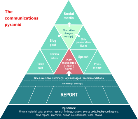
© Andrew Johnston 2026
Soon after I drew this up, I found out that the Urban Institute, a think tank in Washington DC, had devised a similar model, which resembled mine (with a few DC things thrown in):
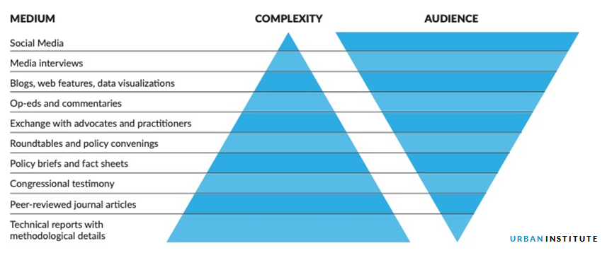
The Urban Institute model cleverly shows that the higher you go, the more people you reach. Down the bottom? “Technical reports with methodological details” … well, that describes a huge number of current UN/NGO/think tank reports. Look how many people they are reaching.
As if any further evidence were needed, back in 2014 a couple of World Bank analysts decided to check how many World Bank reports were being read. Over five years, 32% of World Bank policy reports had not been downloaded once. All those lonely PDFs, sitting there unloved, despite the millions of dollars that had been spent on them.
The introduction of their report [PDF][text], however, contains a clue:
About 13 percent of all policy reports are downloaded at least 250 times, while about 32 percent are never downloaded. Over 31 percent of policy reports are never downloaded, while about 13 percent are downloaded at least 250 times.
The same information (with that weird 32%/31% tweak) is repeated sentence after sentence. This mistake has remained online, at the links above, for 12 years, in a ghastly piece of irony: if no one is reading your reports, perhaps you need to fix them.
First published January 22, 2026